TRENDS: KITCHEN CABINETRY COLOURS
KITCHEN CABINETRY - OH THE COLOUR!
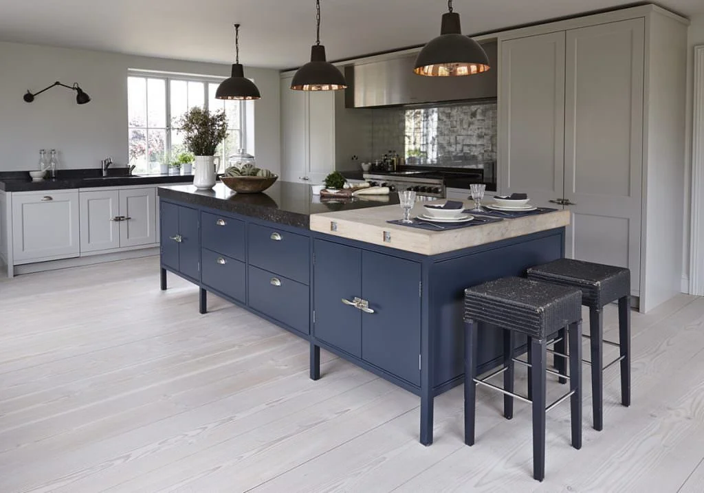
Mowlem & Co. - Heritage
NAVY
WHAT IS IT?: The new neutral.
COLOURS: Not all hues of navy are the same! From Farrow and Ball’s “Hague Blue” to Benjamin Moore’s “Gentleman’s Gray”, the options for this classic shade of blue is fairly endless.
SUITABILITY: White will always be the forever safe favourite with grey’s or taupes’ hot on its heels and there’s none so comfortable with that pairing than the enduring warm or cool based navy blue.
Navy has been coming into fashion for a while. We’ve seen it all over the blogs and magazine’s for the past couple of years, however, it is still relatively “new” for the mass public to see as a tangible option in people’s homes. However, I’ve started seeing it creep into the suburban home kitchen remodels of the affluent New England area of the US lately (softly, softly...using it not as a whole but in part on an island).
Four years ago I started planning to re-do my bathrooms, I wanted a navy vanity, there was nothing, I mean nothing in mass production that was offering that colour. Now, you also seeing navy infiltrating bathroom furniture as well. Navy is here to stay and with that said, I do think we will start to see more and more pairings using rich colours against whites and grey’s as well as more adventurous types biting the bullet as a whole like...
Commune Design - Goldwater Canyon
GREEN
WHAT IS IT?: The second new neutral.
COLOURS: Come ‘ere you gorgeous Emerald, Teal, Kelly and Studio!
SUITABILITY: Now this is a colour for a kitchen which I think stands the test of time. So much so that I find this colour is easier en-masse as cabinetry to integrate into most households. It is an easily updatable colour for the generations because you can update your surroundings via accent textiles, decorations, flora or fauna.
I’m not sure this will become as integrated or ubiquitous as navy but I do believe green kitchens are having their moment, and the best is yet to come. And interestingly (or maybe not) I think more people will be willing to have an entire kitchen in green cabinetry than navy.
The reason...Green is such an evocative colour. Who doesn’t love a billiard room or library in a strong, deep green? Don’t you feel like a cool traditionalist while playing pool over gin & tonics while breaking with your mates? Or smart and Harry Potter wizard-like hunkering down in front of a fire reading something immersive coddled within hunter green walls? It’s the colour of Christmas trees! Or summer limes in your favourite drink, the first signs of spring and a freshly mown lawn. Of renewal, catching frogs.... my eyes happen to be green...er I digress. It’s the smell of fresh herbs and probably most tellingly, it’s the colour of money baby. Green is so money.
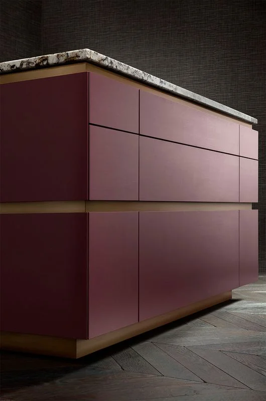
Smallbone of Devizes - Modernist
PLUM
WHAT IS IT?: The not so obvious and a little bit scary new neutral.
COLOURS: Grandma? Hello? Nope, she’s not home. Welcome Plum.
SUITABILITY: A.K.A “maroon”, “burgundy” or “aubergine”. Let me start by saying that you need to have an innate sense of tone or a designer who truly has a wonderful sense of colour (yes, I might be alluding to myself, so what?) to get THE perfect neutral based plum that will not be limited to a passing trend or particular era and date. It is risky but it can be done. And beautifully.
It’s obvious...I love with colour. But I don’t just love EVERY shade of this colour. I am discriminate. The tone of a colour is particularly important.
Plum is a unique colour. It is various shades of wine, mulberry, garnet, claret, black and blue. There is a hint of warmth with a bit of coppery orange or Belgian grey. Even more so, I generally find shades of purple are often used garishly (this coming from a woman who lived for Purple Rain and all things purple - literally - in her young life). Yet I think Garanimals were way ahead of their time when they introduced the matching maroon velour jumpsuit. And that’s not because my mother dressed me in that outfit. I owned it. I genuinely felt the bomb. Granted it was the ‘70s and I was nine but intuitively I knew... this is a colour not to be reckoned with. Just because it happened to exist in the unfortunate material of velour but because EVEN in velour, it looked swank. Now come on people....if Smallbone of Devizes if pulling out all the stops in not only a handless range but in this colour? What does that tell you?


