THE DESIGN FILES FROM STUDIO L, LONDON 2025: USING RED - The whys & hows of it
STUDIO L’S DESIGN FILES
USING THE COLOUR RED (here’s why and how)
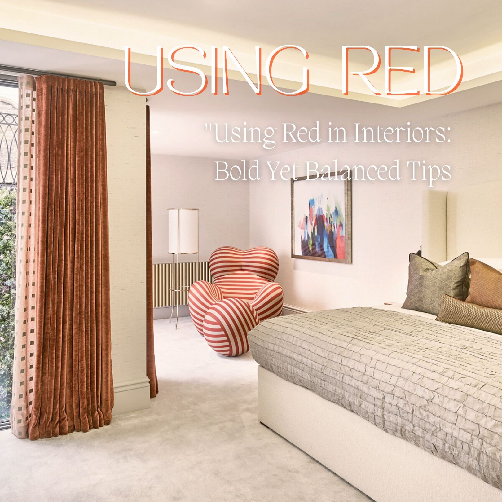
I love red. I love using it in interiors, and if you flick through many of our projects in our Studio L portfolio, you'll notice I always have it in there (or some rendition of the hue). Rarely, I don't find some version of red, whether it be rust, burgundy, fuchsia or anything in the red family or with a red undertone to round out a Studio L aesthetic. Interestingly, when I ask clients what colours they don’t want to live with, the colour most often stated is RED. Why is that? I think because, as a colour, it's so evocatively LITERAL. RED is RED. But is that all there is to consider regarding this dynamic and fundamental colour?
Sure, I mean, if you use it like Harper's Bazaar and Vogue editor Diana Vreeland used it (as evidenced below). Vreeland infamously gave the brief to her iconic designer Billy Baldwin to transform her Park Ave apartment with an aggressive overabundance. Famously informing him, “I want this place to look like a garden, but a garden in hell.”
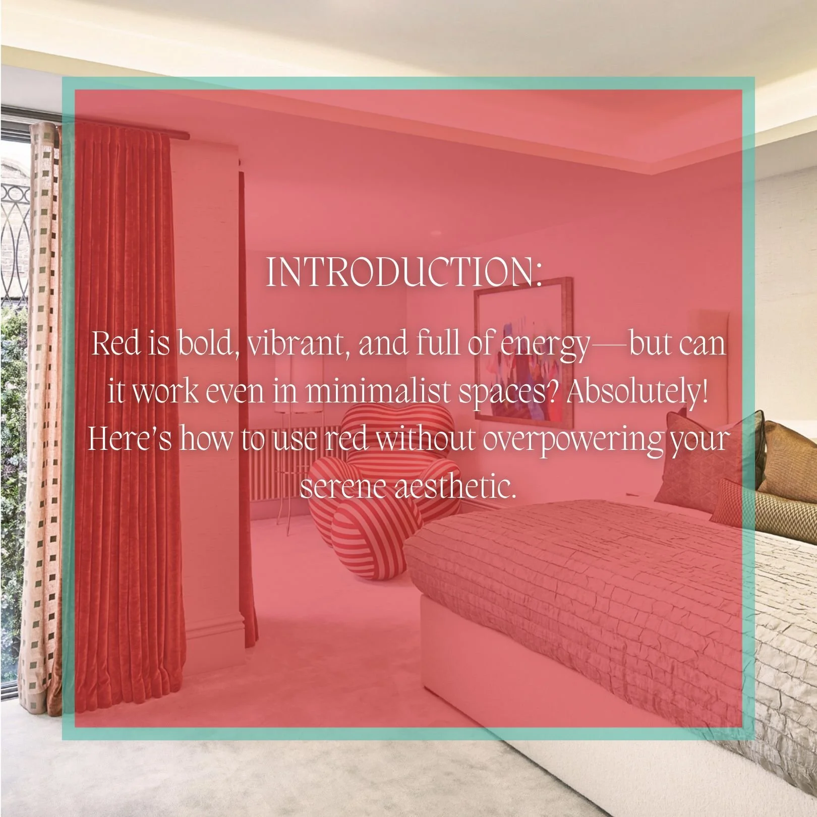
While an interesting brief, most of us don’t exactly want an imagined creation of a glamour pad in hell, no matter how chic. Am I right?? So understandably, there is a connotation attached to the colour, and many clients worry it's too overpowering; others feel that if they want a clean and serene environment, they imagine that red has no place in spaces like that, but I'm here to tell you …. I disagree. Here’s why.
While studying at university, I took a class on subliminal advertising, which was fascinating and probably the most impactful course I took, and red was one of THE colours that elicited considerable subliminal messages depending on its use. From the biological (alertness and attention, danger, love, passion and desire) to esoteric and religious symbolism (power, dominance, danger, life, blood, wealth, prestige and good fortune). As well as directing marketing and consumer behaviours, why do you think almost every fast food company has red branding? Because it induces hunger and appetite! It also creates a sense of urgency; "Limited time offer!", "SALE!". There are even gender variations; some studies suggest men may perceive red as more sexually attractive, while women may associate it with confidence and empowerment. In art and cultural terms, red can be used in artworks to represent transformation and enlightenment or be used in a celebration (e.g., weddings in India) or mourning (e.g., South Africa). And did you know - it's the 1st colour babies see! I'm telling ya... red is one interesting colour!
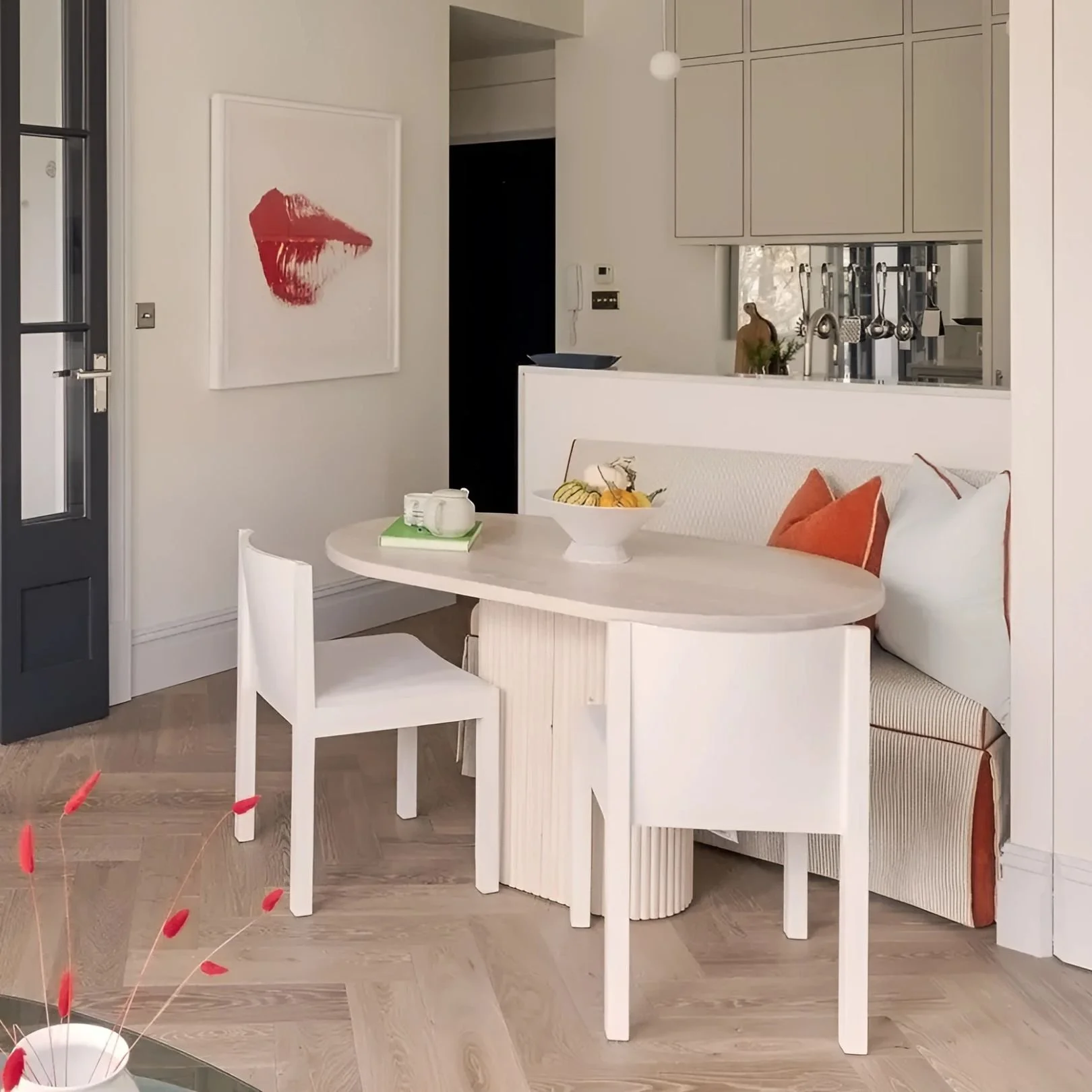
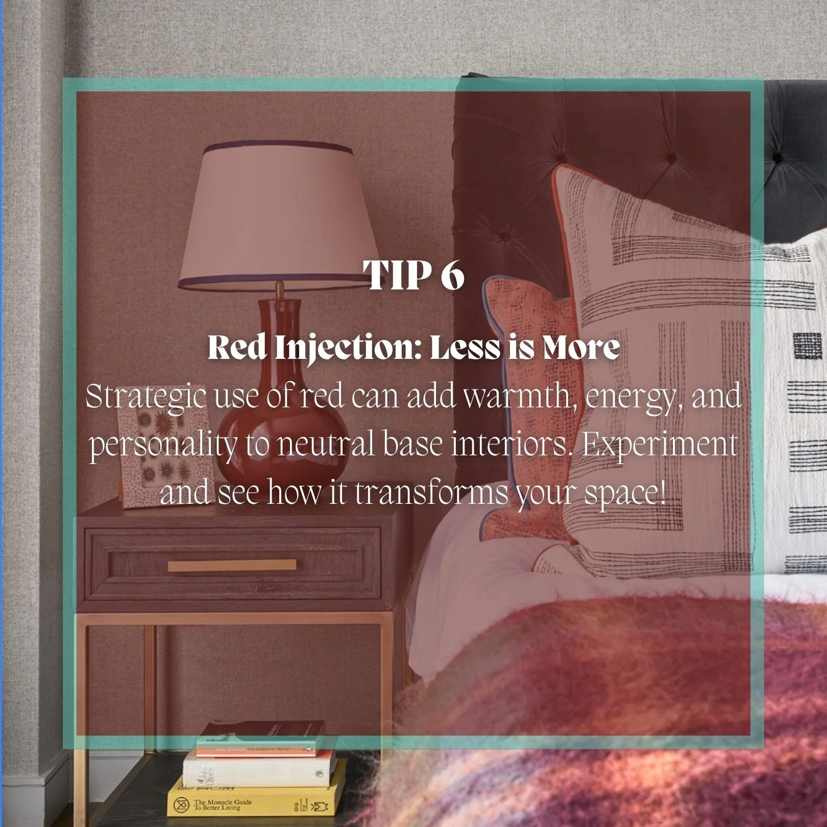
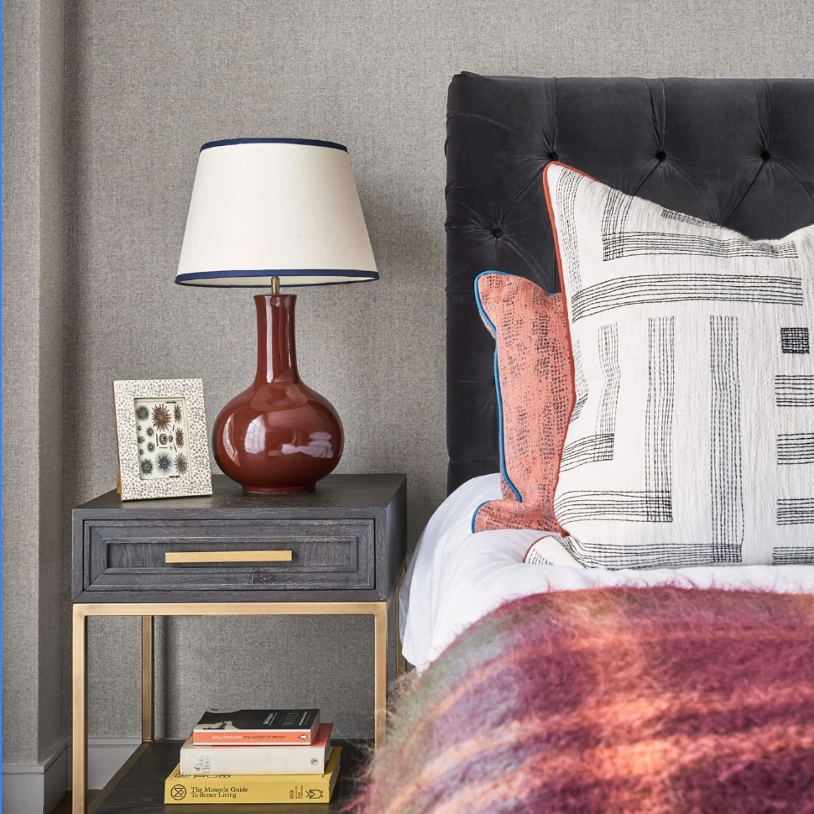
In terms of interior design and decor, I like to use red this way: to balance and focus attention, round out a room, and add a bit of excitement, whimsy, or even drama. I see its wow factor, like punctuation at the end of a sentence. A little drama in one's interior never hurts if it's done pleasingly.
And red isn't just red. There are hundreds to thousands of named colours with red as a component. In a more scientific sense, the visible spectrum of light contains countless variations, so the theoretical number of colours with red in them is nearly infinite due to the continuous blending of red with other wavelengths.
So, my advice is don't limit yourself to the literal! And allow yourself to explore any number of infinite versions and hues of this hearty colour!
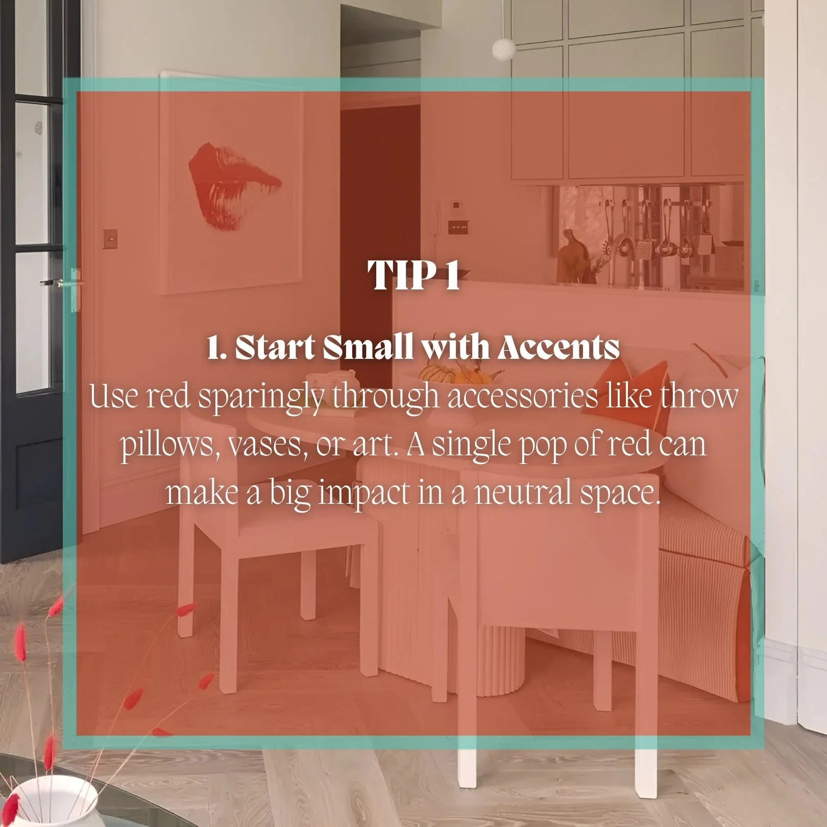
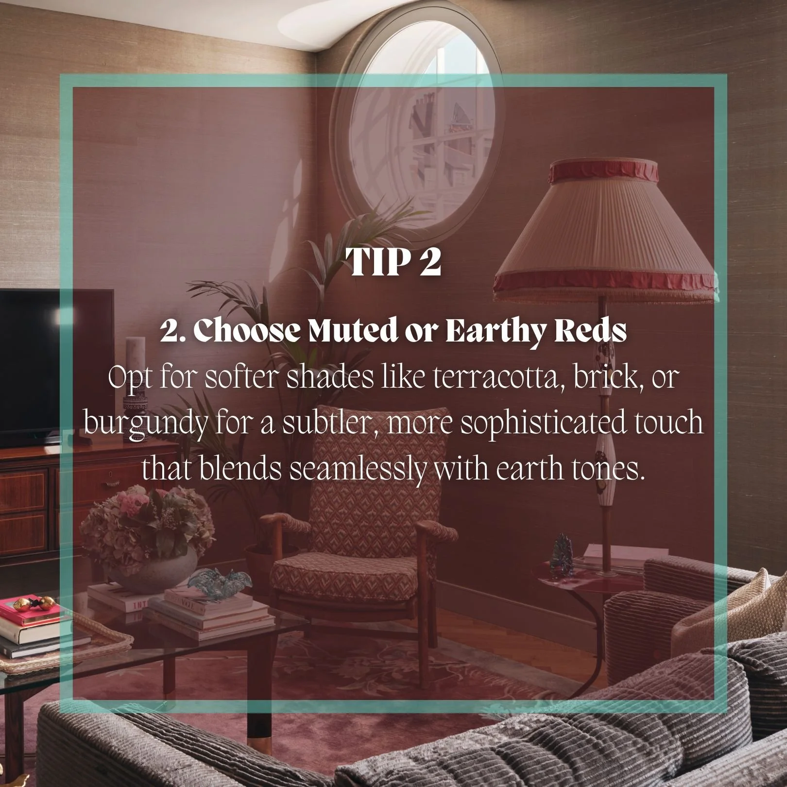
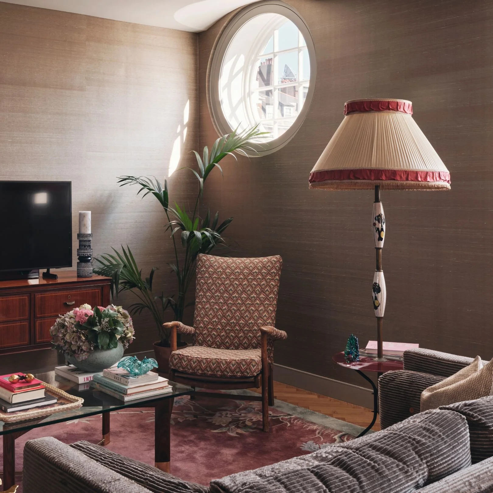
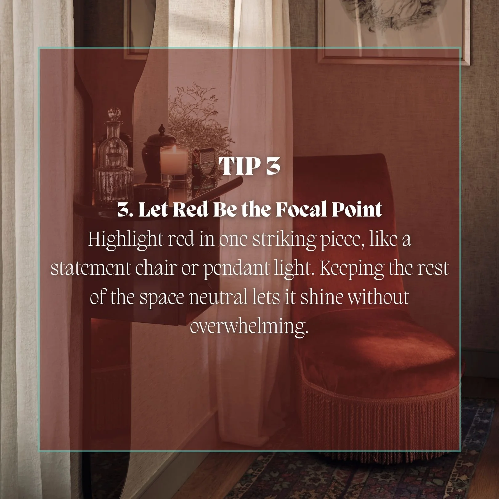
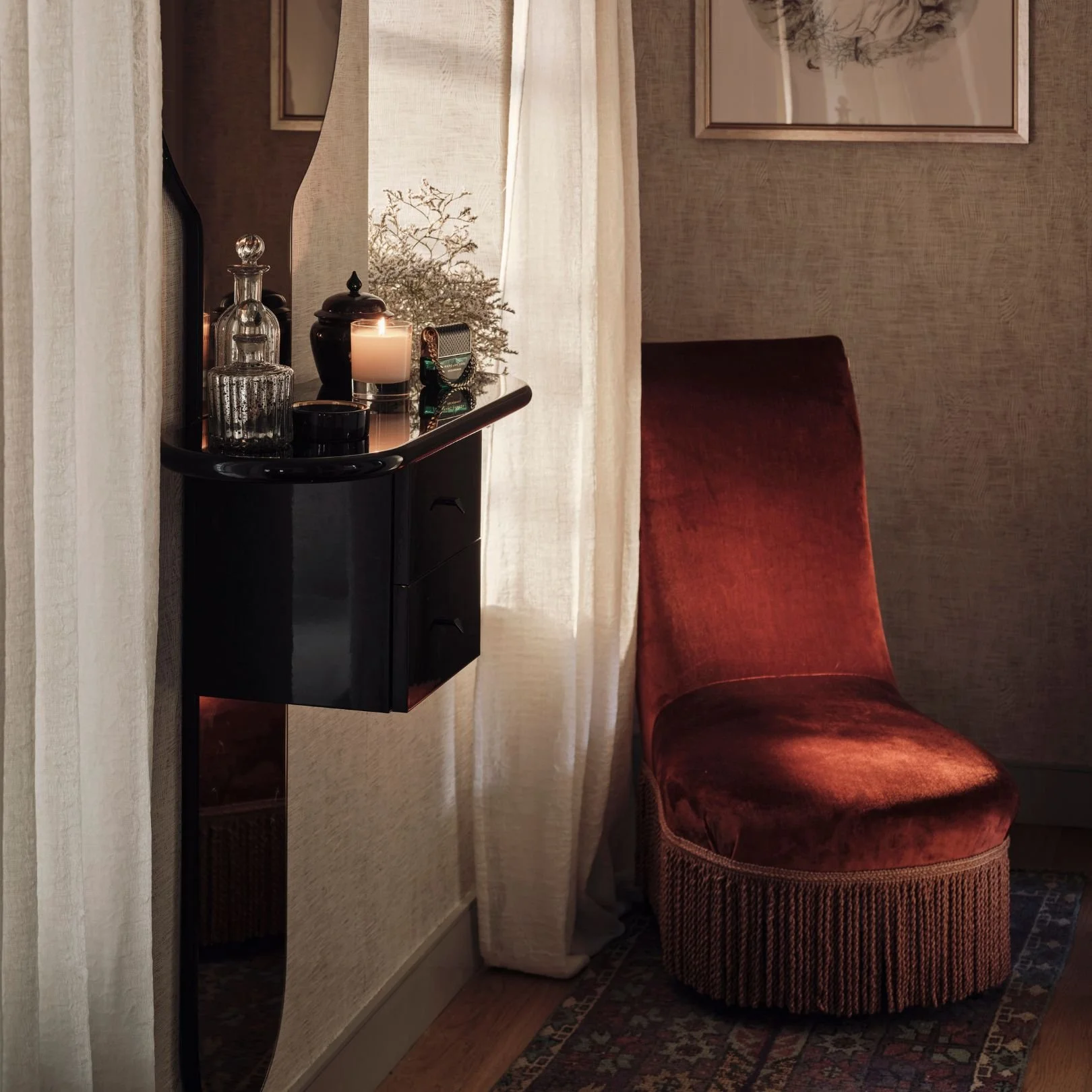
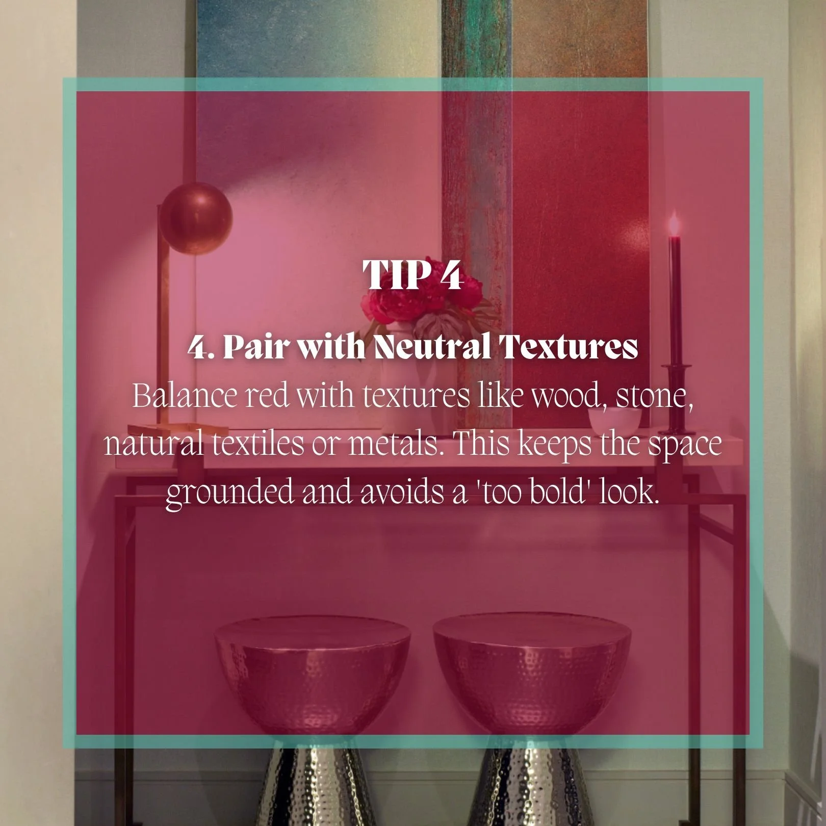
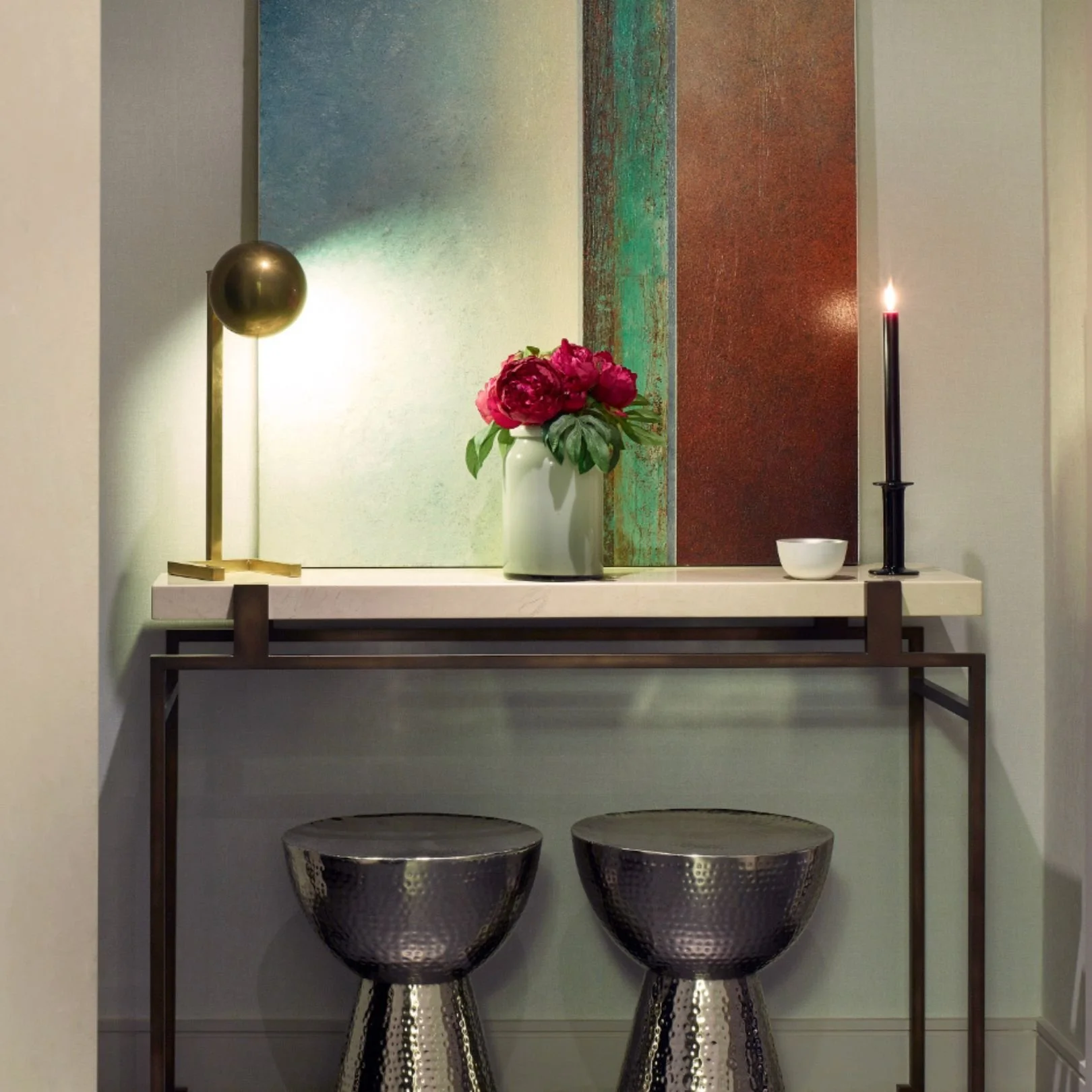
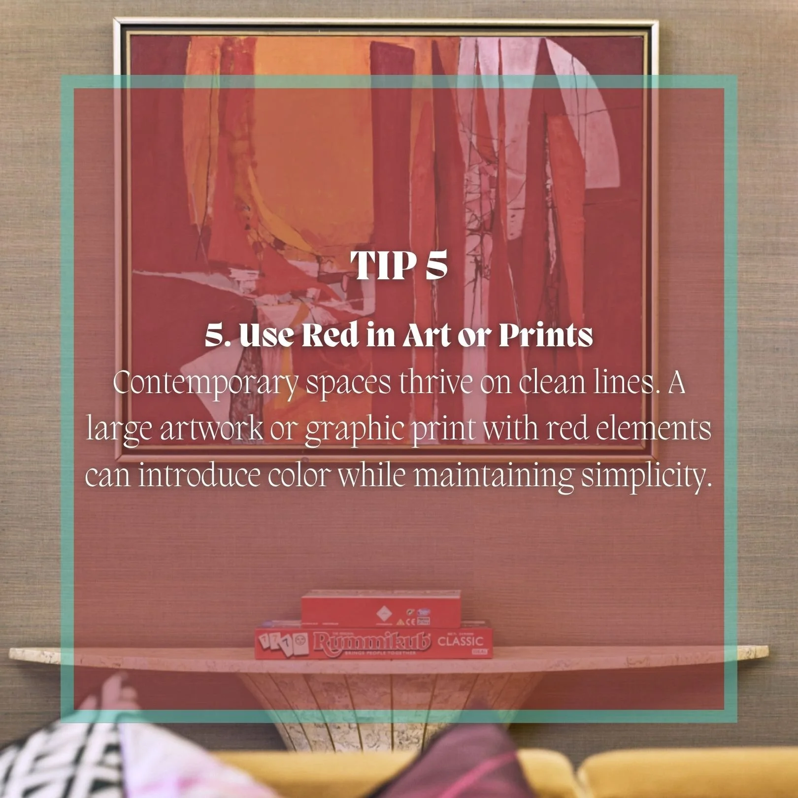
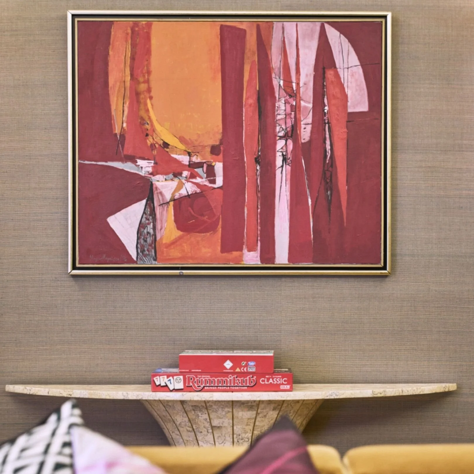
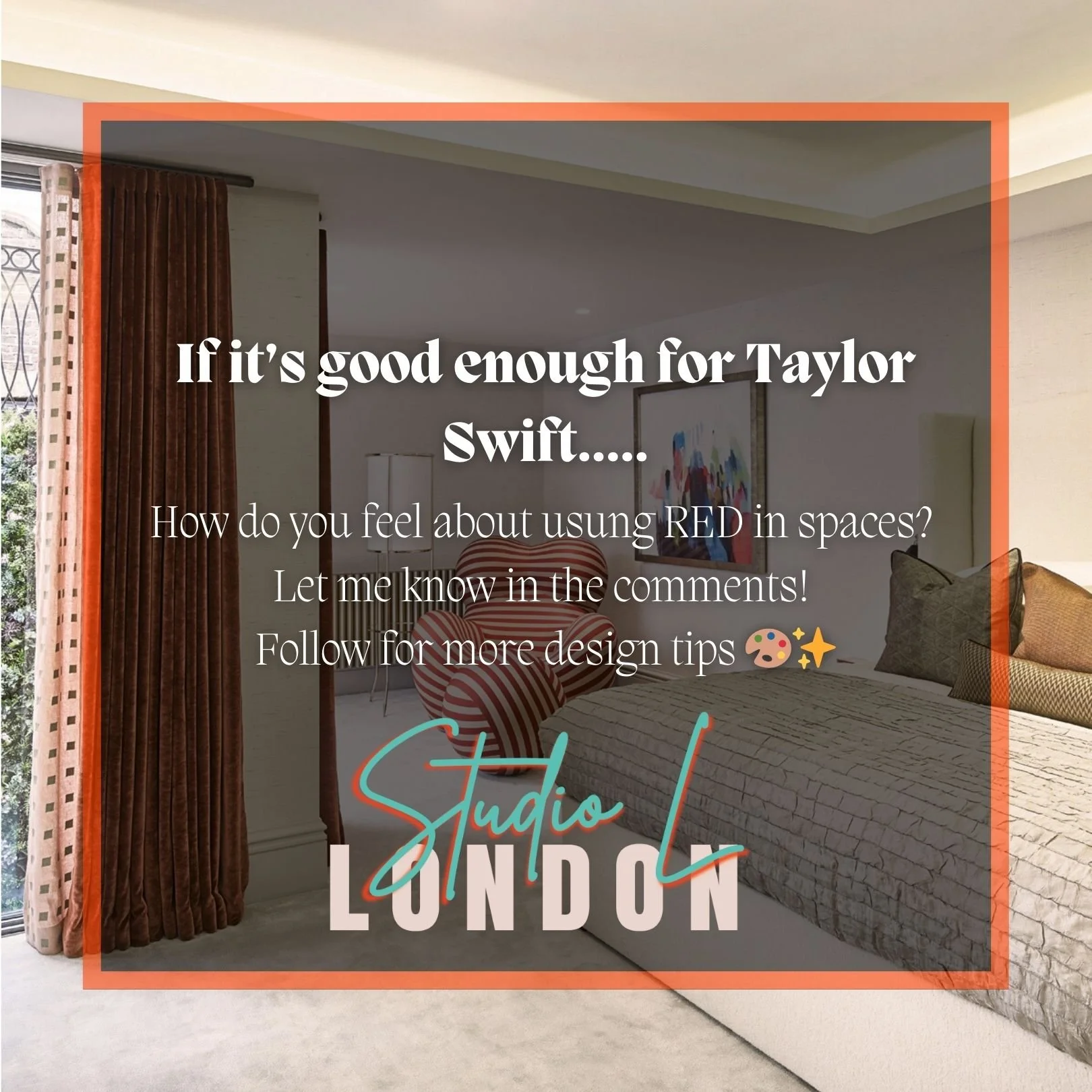
Have a look through this short carousel to help illustrate tips on how you can also use a version of red in your interior. Thanks for reading. Let me know your thoughts in the comments section, and email or call the studio to book a colour consultation today!


